Image Optimisation: Your Biggest Performance Win
Ever opened a website and watched the hero image take what felt like an age to appear? You probably didn't wait around. Neither does anyone else.
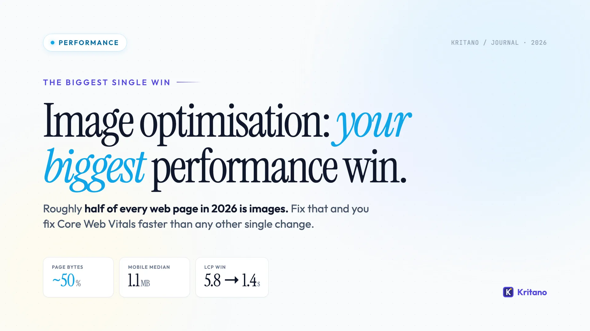
Here's the uncomfortable truth: on the median web page in 2026, images make up roughly half of all the bytes shipped down the wire. According to the HTTP Archive Web Almanac, the median mobile page now serves about 1.1MB of image data - more than CSS, JavaScript, and fonts combined. If you only have time to fix one thing on your website this quarter, image optimisation is almost certainly the biggest performance win you can get.
I'm going to walk you through exactly how to do it - in plain English, with the tools I actually use, and the trade-offs nobody likes to mention.
Why Image Optimisation Beats Almost Every Other Fix
Most "speed up your website" advice focuses on JavaScript bundles, render-blocking CSS, or caching headers. All of that matters. But here's what nobody tells you: the average page now has 22 images and 1.1MB of image weight on mobile, and the largest single image is usually the Largest Contentful Paint (LCP) element - the metric Google uses to decide if your site feels fast.
In essence, if your hero image is a 2MB JPEG, your LCP score is dead before any other optimisation can save it. Fix the image and you've fixed the metric.
There's a second reason image optimisation pays off so well: it compounds. A faster site converts better, ranks better, and costs less to serve (your CDN bill gets smaller). One change, three wins. Not bad.
The Five Things That Actually Move the Needle
Most "image optimisation" articles list 17 things you can do. In my honest opinion, five of them do 90% of the work. Here they are, in order of impact.
1. Convert to WebP or AVIF
JPEG and PNG are showing their age. Modern formats are dramatically more efficient:
- WebP is around 25-35% smaller than JPEG at the same visual quality. It's supported in every modern browser and has been since 2020.
- AVIF goes further - typically 50% smaller than JPEG for the same quality. Browser support hit ~95% in early 2024 and is now effectively universal outside legacy enterprise environments.
The tooling here has gotten genuinely good. Squoosh (squoosh.app) is Google's free, in-browser converter and it's brilliant for one-off jobs. TinyPNG handles bulk conversion. If you're on WordPress, plugins like ShortPixel or Imagify will do this automatically on upload.
Quick gotcha: serve modern formats with a fallback. The <picture> element handles this elegantly:
<picture>
  <source srcset="hero.avif" type="image/avif">
  <source srcset="hero.webp" type="image/webp">
  <img src="hero.jpg" alt="A descriptive alt text">
</picture>
Browsers that support AVIF use that. Older ones step down to WebP. Ancient ones fall back to JPEG. Nobody gets a broken image.
2. Resize Images to the Size They're Actually Displayed
This one drives me up the wall. I audit websites every week and I still see 4000x3000 pixel hero images being rendered into 1200x675 slots. The browser dutifully downloads all those extra pixels, then throws them away.
The fix is the srcset attribute, which tells the browser "here are several sizes of this image - pick the one that fits the device":
<img
  src="hero-1200.webp"
  srcset="hero-600.webp 600w, hero-1200.webp 1200w, hero-1800.webp 1800w"
  sizes="(max-width: 768px) 100vw, 1200px"
  alt="Descriptive alt text">
A phone gets the 600px version. A laptop gets the 1200px version. A 4K monitor gets the 1800px version. Nobody downloads more than they need.
If that looks fiddly, modern CMSes and frameworks do most of it for you. Next.js has <Image>, Astro has <Image>, WordPress generates srcset automatically since version 4.4. Use the platform features that exist - don't reinvent the wheel.
3. Lazy Load Everything Below the Fold
The image at the top of your page (the LCP element) needs to load immediately. Every other image should wait until the user scrolls near it. The browser will handle this for you with one attribute:
<img src="below-the-fold.webp" loading="lazy" alt="...">
loading="lazy" is supported in over 96% of browsers and saves a remarkable amount of bandwidth on long pages. On a content-heavy blog post, you can easily cut initial page weight in half just by lazy-loading the images that aren't visible yet.
Critical pairing: the hero image should explicitly opt OUT of lazy loading and get fetchpriority="high" so the browser knows to prioritise it:
<img src="hero.webp" fetchpriority="high" alt="Hero">
This is one of the highest-ROI two-line changes you can make to a website. I've seen LCP scores drop by 1-2 seconds from this alone.
4. Always Set Width and Height
This isn't about page size - it's about layout stability. When you don't tell the browser how big an image will be, it has to wait for the image to load before it can lay out the page. As images pop in, content jumps around. This wrecks your Cumulative Layout Shift (CLS) score and creates the deeply annoying experience of trying to tap a button that just moved.
Set width and height attributes on every single image:
<img src="photo.webp" width="800" height="600" alt="...">
The browser uses the ratio to reserve space before the image arrives. No jumps, better CLS, happier users. It feels old-school but it's now one of the official Core Web Vitals recommendations.
5. Use a CDN with Image Optimisation Built In
If you've done the four things above, you're already in the top 10% of websites for image performance. The next step is automation: instead of manually optimising every image, let a CDN do it for you, on demand, per device.
The big options:
- Cloudflare Images / Cloudflare Polish - bundled with Cloudflare, dirt cheap, hands-off.
- Cloudinary - the most feature-rich, but pricier. Great for ecommerce and image-heavy sites.
- ImageKit - similar to Cloudinary, often cheaper at small scale.
- Bunny CDN with Bunny Optimizer - blazingly fast, very affordable, my personal favourite for client work.
These services intercept image requests, transform the file to the optimal format and size for the requesting device, and cache the result. Set it up once and forget about it.
While I've probably just sold you on a CDN, there's a downside: it's another moving part to monitor and pay for. For a small marketing site, the manual approach with WebP and srcset is genuinely fine. For an ecommerce site with 10,000 product images, a CDN is non-negotiable.
Common Image Optimisation Mistakes to Avoid
Even with the right tools, there are a few traps I see over and over:
- Compressing past the point of usefulness. WebP at quality 50 looks worse than JPEG at quality 80. The point is efficient compression, not maximum compression. Aim for quality 75-85 on WebP, 50-65 on AVIF.
- Using PNGs for photos. PNG is for graphics with sharp edges and transparency (logos, icons, screenshots). Photos belong in WebP or AVIF.
- Forgetting about retina displays. A 1200px-wide image looks blurry on a 2x display in a 1200px slot. Serve 2x versions via
srcsetfor high-DPI devices. - Ignoring SVG for icons and illustrations. A 12KB SVG icon scales infinitely and beats any raster format. If it can be vector, make it vector.
- Not auditing. You think you've optimised everything until you actually measure. Run PageSpeed Insights on your homepage right now and look at the "Properly size images" and "Serve images in next-gen formats" sections.
How Much Difference Does This Actually Make?
I recently audited a small ecommerce client whose product pages were loading in 6.2 seconds. The breakdown:
- Hero image: 3.4MB JPEG, served at full size to mobile.
- Product gallery: 12 PNGs, none lazy-loaded.
- No CDN, no responsive images.
After two afternoons of work - converting to WebP, adding srcset, lazy-loading the gallery, fronting it with Cloudflare Polish - their LCP dropped from 5.8s to 1.4s. Total page weight on mobile fell from 7.1MB to 1.2MB. Their conversion rate improved by 14% over the following month.
That's not unusual. It's just what happens when you fix the biggest source of bloat on a typical website.
A Quick Audit You Can Run Right Now
Open Chrome DevTools (right-click anywhere on your homepage and hit "Inspect"), go to the Network tab, filter by Img, then reload the page. You'll get a sortable list of every image, its file size, and its dimensions.
Sort by size, descending. Anything over 200KB is suspicious. Anything over 500KB is almost certainly fixable. Anything over 1MB is doing real damage.
Then check the Lighthouse tab and run a performance audit. Look at the "Opportunities" section. If you see "Serve images in next-gen formats" or "Properly size images", those are flagged directly because they're slowing you down.
We've packaged the full pre-launch performance checks - including image optimisation, Core Web Vitals targets, and 85 other checks across all six pillars of website health - into a one-page reference at /resources/website-health-checklist. It's the same list I use when auditing client sites.
The Bottom Line
If your images are heavy, slow, or oversized, nothing else you do to speed up your website will fully fix the experience. Conversely, if you nail image optimisation - modern formats, responsive sizes, lazy loading, dimensions set, ideally with a CDN doing the heavy lifting - you've moved the needle on Core Web Vitals more than any other single change.
Five things. Maybe a day's work. Done well, it's the highest-leverage performance win on the modern web.
If you'd like a full breakdown of how your site is performing across image optimisation, Core Web Vitals, and the rest of the six pillars of website health, Kritano can scan your site in a few minutes and tell you exactly what to fix first. No sign-up wall, no credit card. Just run the audit and see what comes back.
Frequently Asked Questions
What's the best image format for the web in 2026?
AVIF is the best-compressing format with broad browser support, typically 50% smaller than JPEG at the same quality. WebP is the safe default - around 25-35% smaller than JPEG and supported in every modern browser. Serve AVIF first, fall back to WebP, and keep JPEG only as a last resort for ancient browsers.
Does image optimisation actually affect SEO?
Yes, directly. Google's Core Web Vitals are confirmed ranking signals, and the Largest Contentful Paint (LCP) metric is usually determined by your hero image. A poorly optimised hero image can sink your LCP score, which hurts your ranking. Faster sites also have lower bounce rates and higher engagement, which feed back into ranking signals.
How do I know if my images are slowing my site down?
Run your homepage through PageSpeed Insights and look at the "Opportunities" section. If you see "Serve images in next-gen formats", "Properly size images", or "Defer offscreen images", those are direct flags that image optimisation will help. You can also open Chrome DevTools, go to the Network tab, filter by "Img", and sort by size - anything over 200KB on a small image is a red flag.
Should I lazy load my hero image?
No. Your hero image is almost always the Largest Contentful Paint (LCP) element, which means it needs to load as fast as possible. Lazy-loading it would delay the page feeling "loaded" and tank your performance score. Instead, add fetchpriority="high" to it and reserve loading="lazy" for images below the fold.
Is a CDN worth it just for image optimisation?
For small sites (under 50 images, low traffic), the manual approach with WebP and srcset is fine. For sites with hundreds of images, ecommerce stores, or anything with significant traffic, an image CDN like Cloudflare Polish, Cloudinary, or Bunny Optimizer pays for itself in bandwidth savings and developer time. It also handles edge cases (retina displays, device-specific formats) automatically.

Founder of Kritano
5 years in web development. I specialise in web auditing, WCAG 2.2 compliance, and search engine optimisation.
I built Kritano after years of running audits with fragmented tools. I write about SEO, accessibility, security, and performance based on real auditing data from thousands of scans.